Ava Save Transcript Experience
Ava Save Transcript UXP
UX/UI Design Solution for Managing Users' Transcripts on Desktop and Web Versions of Ava
Ava UX/UI Design Solution for Managing Users' Transcripts on Desktop and Web
UX/UI Design for Managing Users' Transcripts on Desktop and Web Versions of Ava
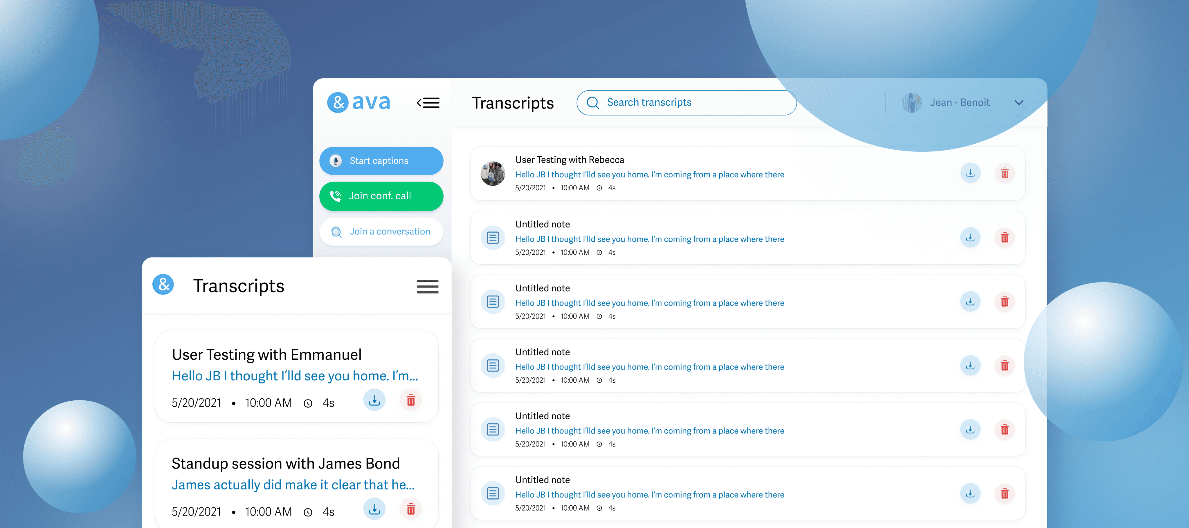


An improved experience on Ava that enable users to save transcripts on both desktop and web versions, addressing a feature request from users over several months.
An improved experience on Ava that enable users to save transcripts on both desktop and web versions, addressing a feature request from users over several months.
Impact
Improved Ava web & desktop app's product-market fit by over 40% 🎉
Improved Ava web & desktop app's product-market fit by over 40% 🎉
Role
Product & Visual Designer
Product & Visual Designer
Product Designer
Duration
2 months
2 months
Tools
Zoom, Figma & Notion
Zoom, Figma & Notion
Zoom, Figma
Year
2021
2021
The Process :
Discovery
Discovery
In the discovery phase, we concentrated on fully grasping our users: their demographics, personas, and motivations. I spearheaded user interviews and a competitive audit, considering users who preferred alternative transcription apps like Otter & Fireflies.
In the discovery phase, we concentrated on fully grasping our users: their demographics, personas, and motivations. I spearheaded user interviews and a competitive audit, considering users who preferred alternative transcription apps like Otter & Fireflies.
User Interviews
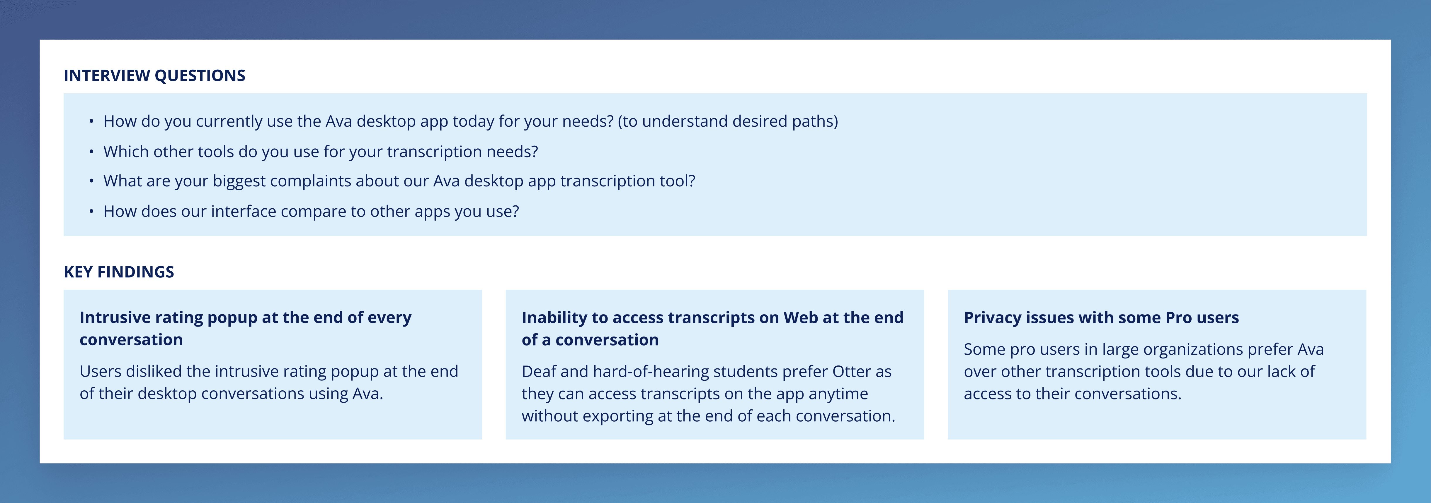
We conducted 30-minute Zoom interviews with four users, each representing different key personas and use cases. Our focus was on hard-of-hearing students and deaf employees to understand their frustrations and pain points with the Ava web platform.
We conducted 30-minute Zoom interviews with four users, each representing different key personas and use cases. Our focus was on hard-of-hearing students and deaf employees to understand their frustrations and pain points with the Ava web platform.


Competitive Audit
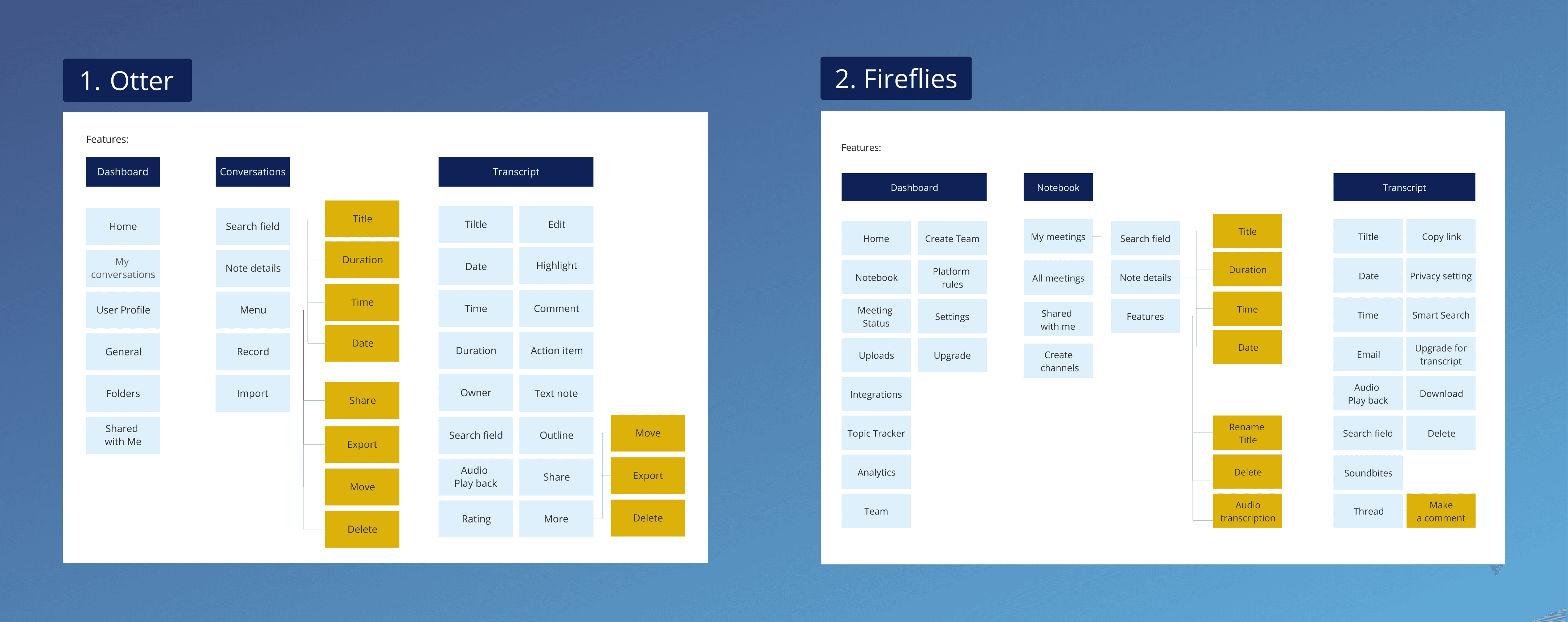
After user interviews, we discovered new users found previous versions of Ava web and the desktop app too limited. They favoured transcription apps like Otter or Fireflies. A competitive audit focused on the save transcript functionality of our competitors guided the features to implement in the Ava web app's save transcript experience.
After user interviews, we discovered new users found previous versions of Ava web and the desktop app too limited. They favoured transcription apps like Otter or Fireflies. A competitive audit focused on the save transcript functionality of our competitors guided the features to implement in the Ava web app's save transcript experience.


Synthesize & Define
Synthesize & Define
Insights and Product Specification
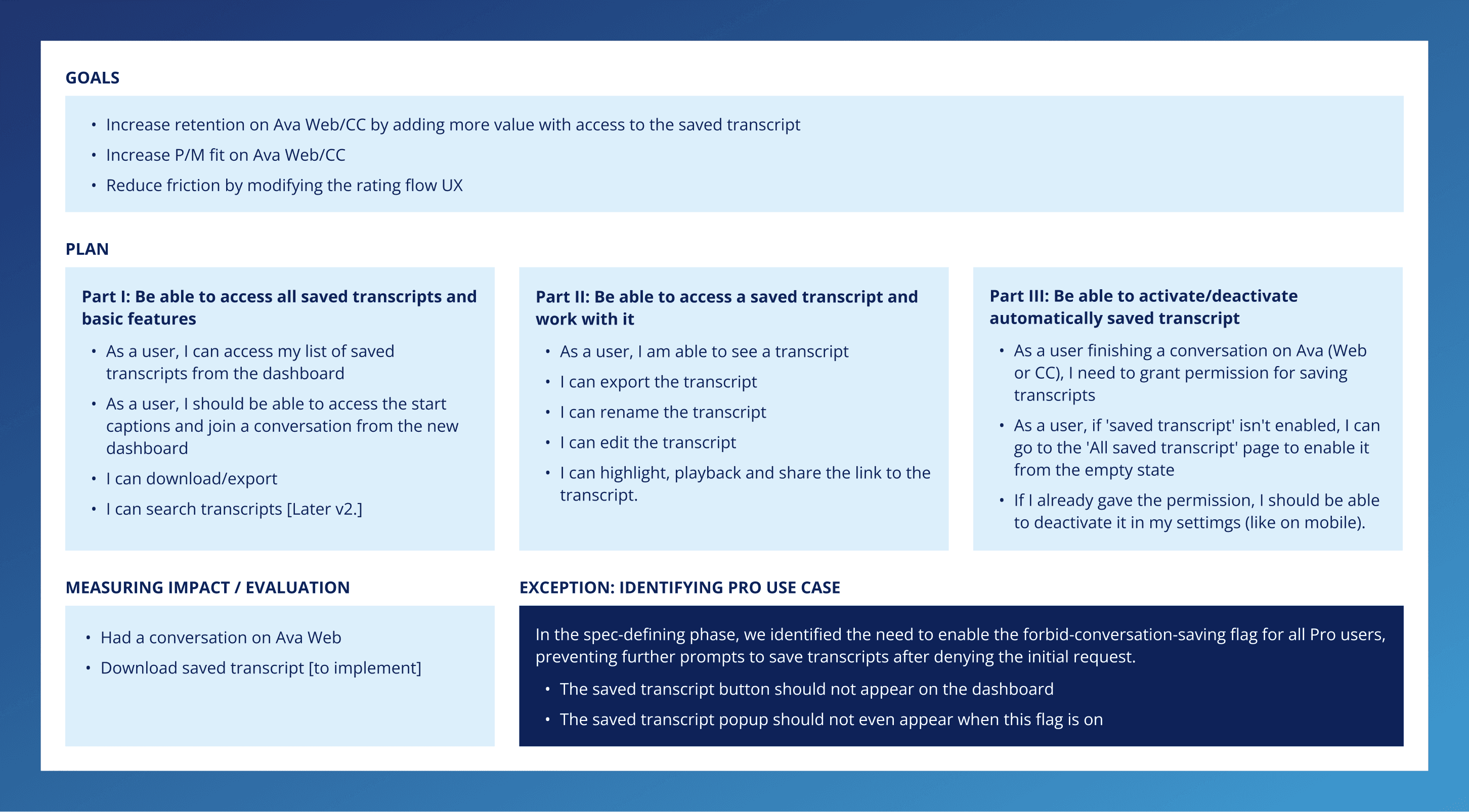
In the discovery phase, we addressed key questions, identified pain points, and shaped the save transcript feature strategy. Initially, replicating the app's solution for web/desktop was planned, but doubts emerged. Discovery highlighted a gap between user preferences and our mobile app solution. In this stage, I collaborated with my project manager on Notion to outline the product strategy, translating user needs into high-level goals and dividing the project into three stages.
In the discovery phase, we addressed key questions, identified pain points, and shaped the save transcript feature strategy. Initially, replicating the app's solution for web/desktop was planned, but doubts emerged. Discovery highlighted a gap between user preferences and our mobile app solution. In this stage, I collaborated with my project manager on Notion to outline the product strategy, translating user needs into high-level goals and dividing the project into three stages.


Design
Design
Wireframes
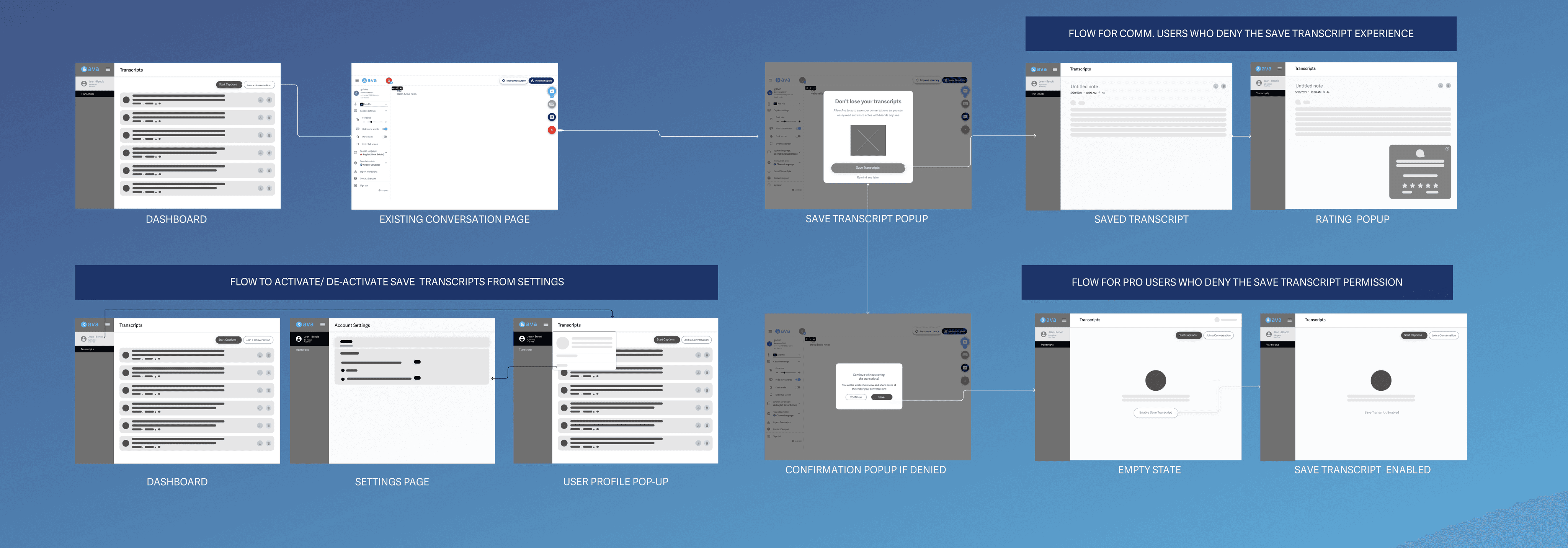
Created low-fidelity wireframes in Figma based on product specifications for quick sharing and iteration with the team. Opted for low-fidelity to gather feedback efficiently while ideating a new experience with minimal design details to facilitate swift progress.
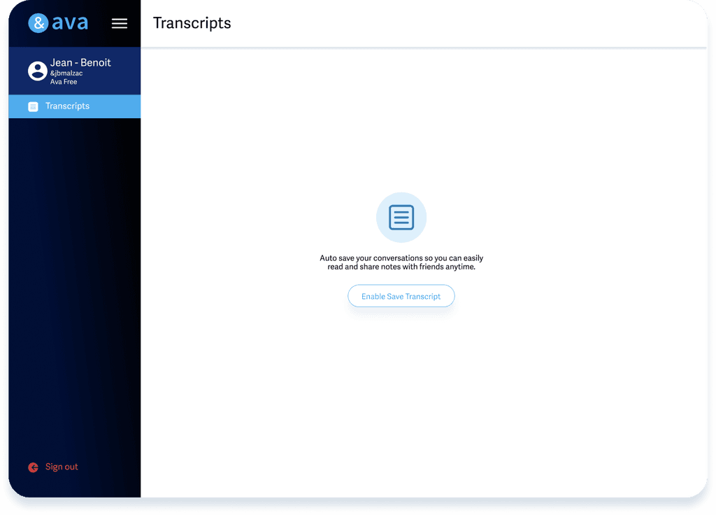
As part of the prioritized transcript-saving features, I crafted a workflow for users to activate and deactivate the feature, resulting in the first version of the web and desktop app settings page. The wireframes offered a comprehensive view of various use cases, guiding our efforts toward the same goal.


Mid Fidelity
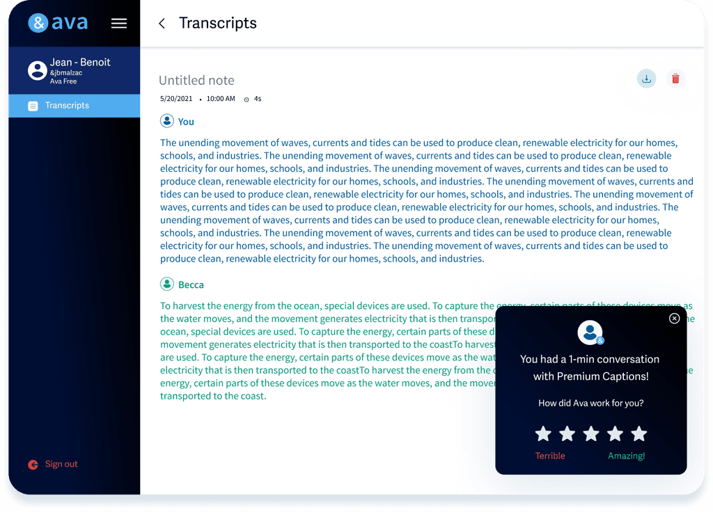
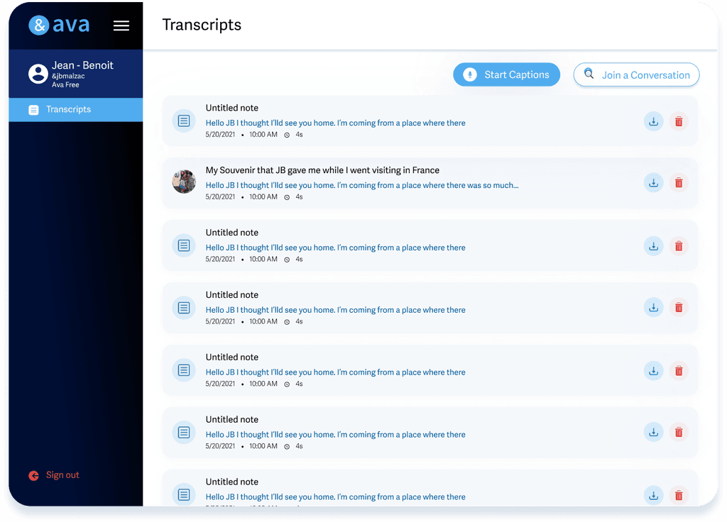
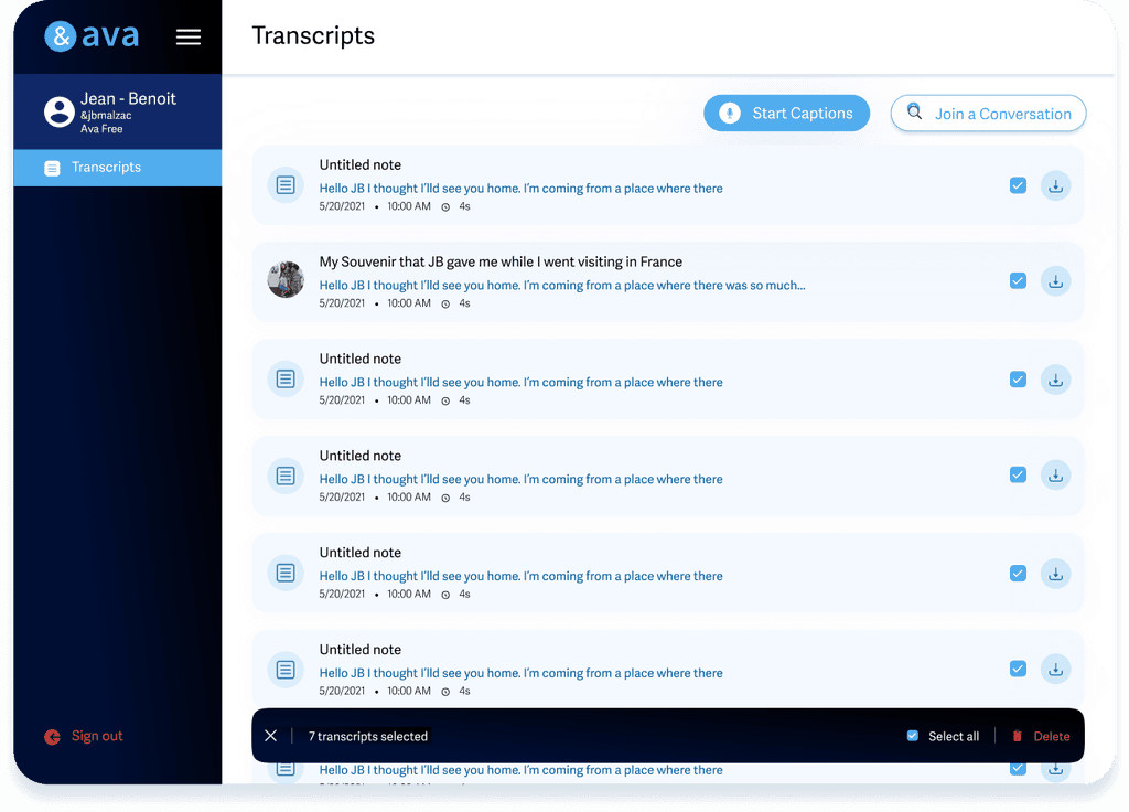
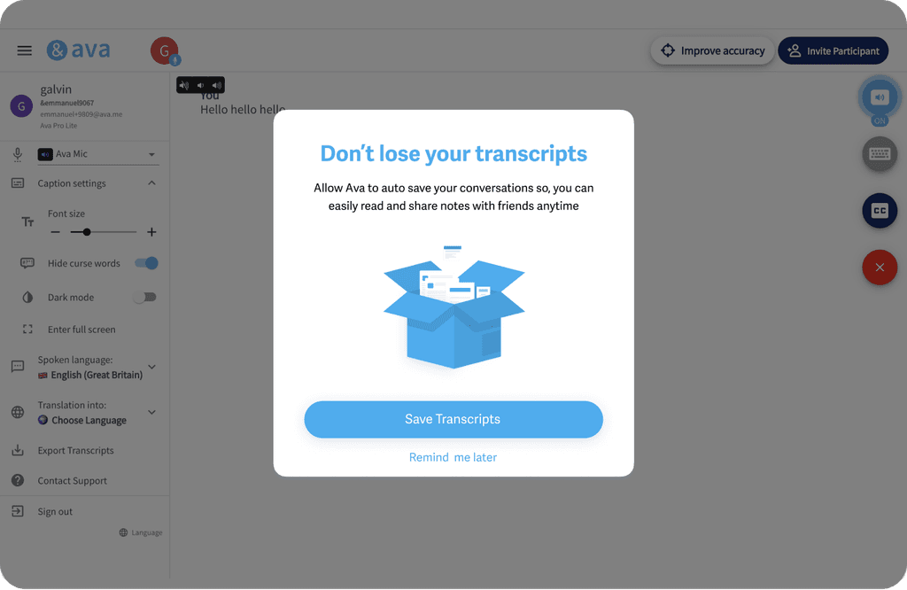
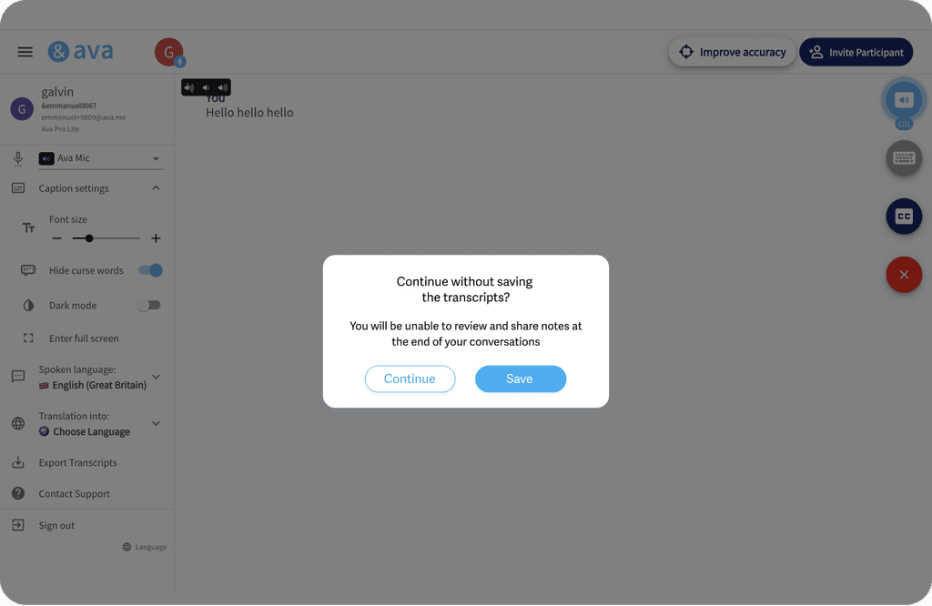
After sharing wireframes and new save transcript ideas in the grooming session, the product team validated workflows. Given a tight development deadline, I swiftly moved to mid-fidelity prototypes for user testing, ensuring the MVP met basic needs. We aimed to minimize development efforts by postponing non-essential features.
After sharing wireframes and new save transcript ideas in the grooming session, the product team validated workflows. Given a tight development deadline, I swiftly moved to mid-fidelity prototypes for user testing, ensuring the MVP met basic needs. We aimed to minimize development efforts by postponing non-essential features.



Test & Iterations
Test & Iterations
Usability Testing
I created a fully functional, mid-fidelity prototype of the new flows using Figma. At the same time, we started recruiting subjects for the test who fit our criteria. We did 4 usability tests in the first round and 3 after iterating on the identified issues.
I created a fully functional, mid-fidelity prototype of the new flows using Figma. At the same time, we started recruiting subjects for the test who fit our criteria. We did 4 usability tests in the first round and 3 after iterating on the identified issues.
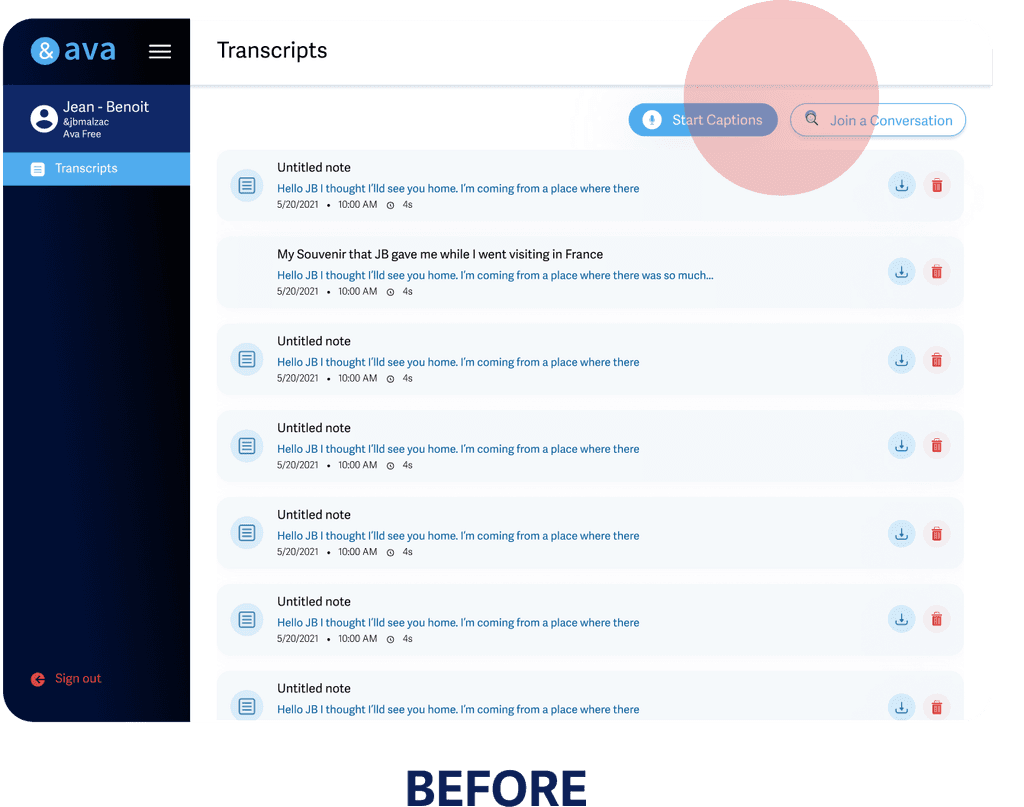
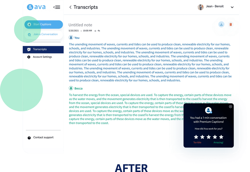
Issue 1: Difficulty accessing Start Captions from the transcript page
2/4 of users struggled with 'Start' and 'Join' CTAs. One user said, 'I didn't realize I had to leave the transcript page; I was already on the transcript tab.
2/4 of users struggled with 'Start' and 'Join' CTAs. One user said, 'I didn't realize I had to leave the transcript page; I was already on the transcript tab.
Solution 1: Display start captions on dashboard and adjust UI colors
We added the CTA’s to the dashboard. After this 100% of the users could easily access the basic functionalities and modified the colour of the dashboard to have better contrast.
We added the CTA’s to the dashboard. After this 100% of the users could easily access the basic functionalities and modified the colour of the dashboard to have better contrast.




Issue 2: Spammy tone of secondary CTA on save transcript modal
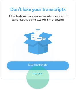
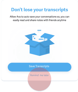
During user testing, some DHH users found the 'Remind me Later' call-to-action (CTA) spammy. One user was uncertain, asking, "Will Ava remind me every time I forget to save my transcript, or prompt me even when I'm not using the app?
During user testing, some DHH users found the 'Remind me Later' call-to-action (CTA) spammy. One user was uncertain, asking, "Will Ava remind me every time I forget to save my transcript, or prompt me even when I'm not using the app?
Solution 2: Change the secondary CTA on the save transcript modal
We added the CTA’s to the dashboard. After this 100% of the users could easily access the basic functionalities and modified the colour of the dashboard to have better contrast.
We added the CTA’s to the dashboard. After this 100% of the users could easily access the basic functionalities and modified the colour of the dashboard to have better contrast.


Improvements + Hi-Fidelity Designs
Once the usability issues were resolved, I moved on to design the final screens in Figma. Also, I’ve checked the competitors and taken a deep dive into my catalogue of references for inspiration.
In this phase, I finalized the design specifications in the different modes (light & dark) for the developers' handoff, including delivering a final high-level notion document containing the UX of the entire experience.


Summary and Learnings
Ava web's new save transcript experience offers users a streamlined dashboard for basic functionalities, minimizing clicks on the homepage. Designs for all associated features are complete, with multi-delete and other secondary features currently live.
The design process emphasized the effectiveness of basic user heuristics, competitive audits, and power user interviews during the discovery phase, leading to a rapid prototyping sprint without extensive research, especially when competitors have tackled similar experiences.