Ava CC Widget Redesign
Ava CC Widget Redesign
One Click Closed Captions for Online Meetings and Video | Ava Desktop App
One Click Closed Captions for Online Meetings and Video | Ava Desktop App


An improved user experience on Ava CC with a seamless, one-click solution and essential functionalities like the Text-to-speech for Deaf and hard-of-hearing users.
An improved user experience on Ava CC with a seamless, one-click solution and essential functionalities like the Text-to-speech for Deaf and hard-of-hearing users.
Impact
Improved the 7-day retention rate of Deaf and hard-of-hearing users by more than 10%, positively impacting the KPI for Product/Market fit qualification. 🎉
Improved the 7-day retention rate of Deaf and hard-of-hearing users by more than 10%, positively impacting the KPI for Product/Market fit qualification. 🎉
Role
Lead & Interaction Designer
Lead Designer
Lead Designer
Duration
2 weeks
2 weeks
Tools
Notion, Asana, Figma & Zoom
Notion, Figma
Notion, Figma & Zoom
Year
2022
2022
Discovery
Discovery
User Interviews
We conducted open-ended user interviews with 3 Deaf & hard-of-hearing users and 2 hearing users to explore how they use the CC app. Identifying common pain points, I collaborated with my product manager to define and prioritize sprint goals.
We conducted open-ended user interviews with 3 Deaf & hard-of-hearing users and 2 hearing users to explore how they use the CC app. Identifying common pain points, I collaborated with my product manager to define and prioritize sprint goals.


Actionable Feedbacks from Users
Actionable Feedbacks from Users
Feature Prioritization
Based on my findings from the user interviews, I was able to quickly collaborate with my product manager to validate key drivers and establish high-level product goals for the project:
Based on my findings from the user interviews, I was able to quickly collaborate with my product manager to validate key drivers and establish high-level product goals for the project:
Enhance keyboard accessibility in CC mode
Introduce keyboard functionality in CC mode
Enable keyboard for seamless group conversations in CC mode, no need to switch to tools like Zoom or Webex.
Enable keyboard for seamless group conversations in CC mode, no need to switch to tools like Zoom.
Enhance UX for restarting conversations in CC mode
After ending a session, show a CC window with options: start a new conversation, switch to full-screen, or quit the app.
After ending a session, show a CC window with options: start a new conversation, switch to full-screen, or quit the app.
Quick access to join conversations on CC mode
This reduces the friction of having to quit the CC window and select the option to join someone else's session
Product designer, Product manager, Full stack developer & QA engineer
Technical Constraints
On Windows OS, pointer events in a draggable region aren't allowed hence, users are unable to click on the transparent area at the top.
On Windows OS, pointer events in a draggable region aren't allowed hence, users are unable to click on the transparent area at the top.
Click-through transparency isn't supported on Electron hence, the design and UI solution for the different flows have to be embedded within the CC window.
Click-through transparency isn't supported on Electron hence, the design and UI solution for the different flows have to be embedded within the CC window.
Ideation
Ideation
The Old Experience
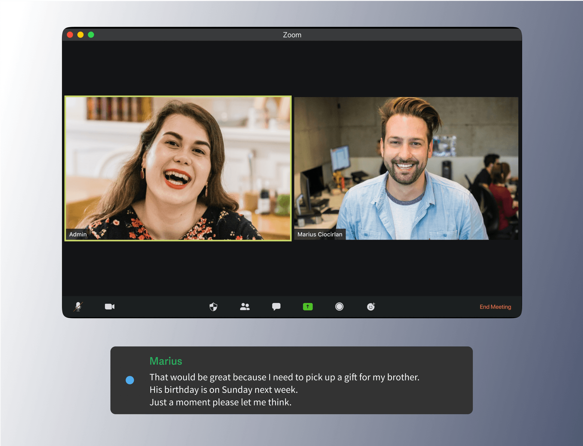


Default state
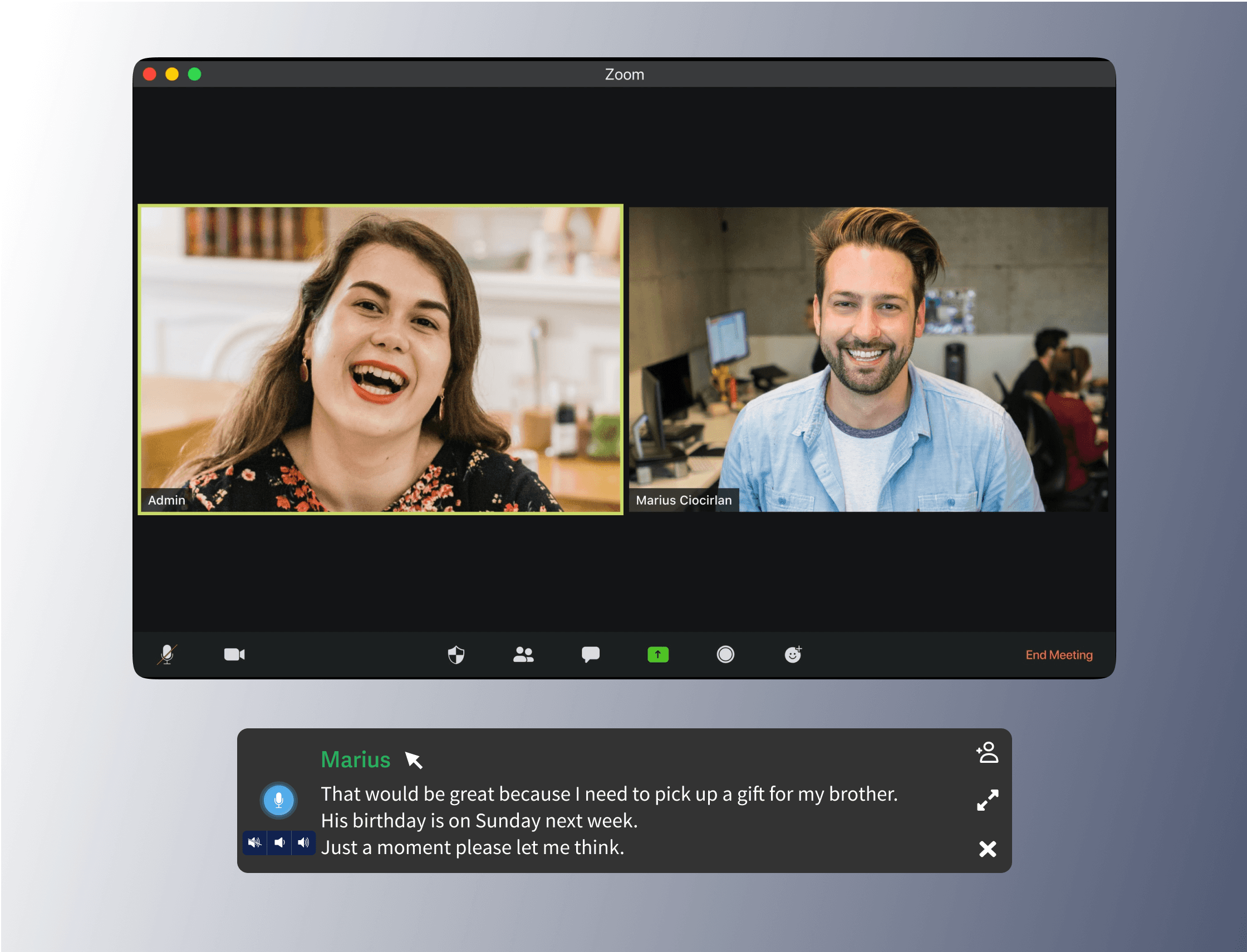


Hover state


Rating pop-up Post convo
Rating pop-up
Rating modal
Wireframes
I crafted low-fidelity wireframes in Figma to align with our goals from the discovery phase. Limited time for the project prompted a need for quick design validation and rapid iteration.
I crafted low-fidelity wireframes in Figma to align with our goals from the discovery phase. Limited time for the project prompted a need for quick design validation and rapid iteration.


Design
Design
Mid Fidelity
After validating wireframes with my PM, I created mid-fidelity prototypes, incorporating design feedback. Prioritizing the overall look, feel, and behaviours to plan the user experience and begin testing.
After validating wireframes with my PM, I created mid-fidelity prototypes, incorporating design feedback. Prioritizing the overall look, feel, and behaviours to plan the user experience and begin testing.


Empty captioning state
captioning state


Invite participant state
Invite state


Default state
Default state


Join conversation state
Join state


Hover state
Hover state


Keyboard input state
Keyboard state


Multi-participants UX
Multi-participants
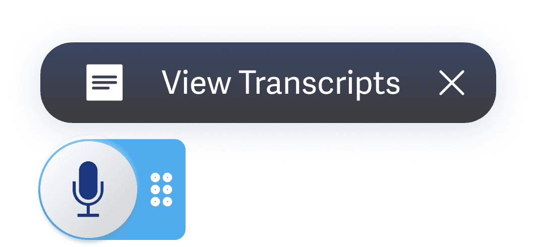

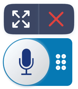
Widget on hover
Widget on hover


Rating state
Rating state


Widget after rating
Widget


Widget after rating
Test & Iterations
Test & Iterations
Usability Testing
For this phase, I conducted a moderated usability test via Zoom with my team and 3 other CC users to assess how well the design met their needs.
For this phase, I conducted a moderated usability test via Zoom with my team and 3 other CC users to assess how well the design met their needs.
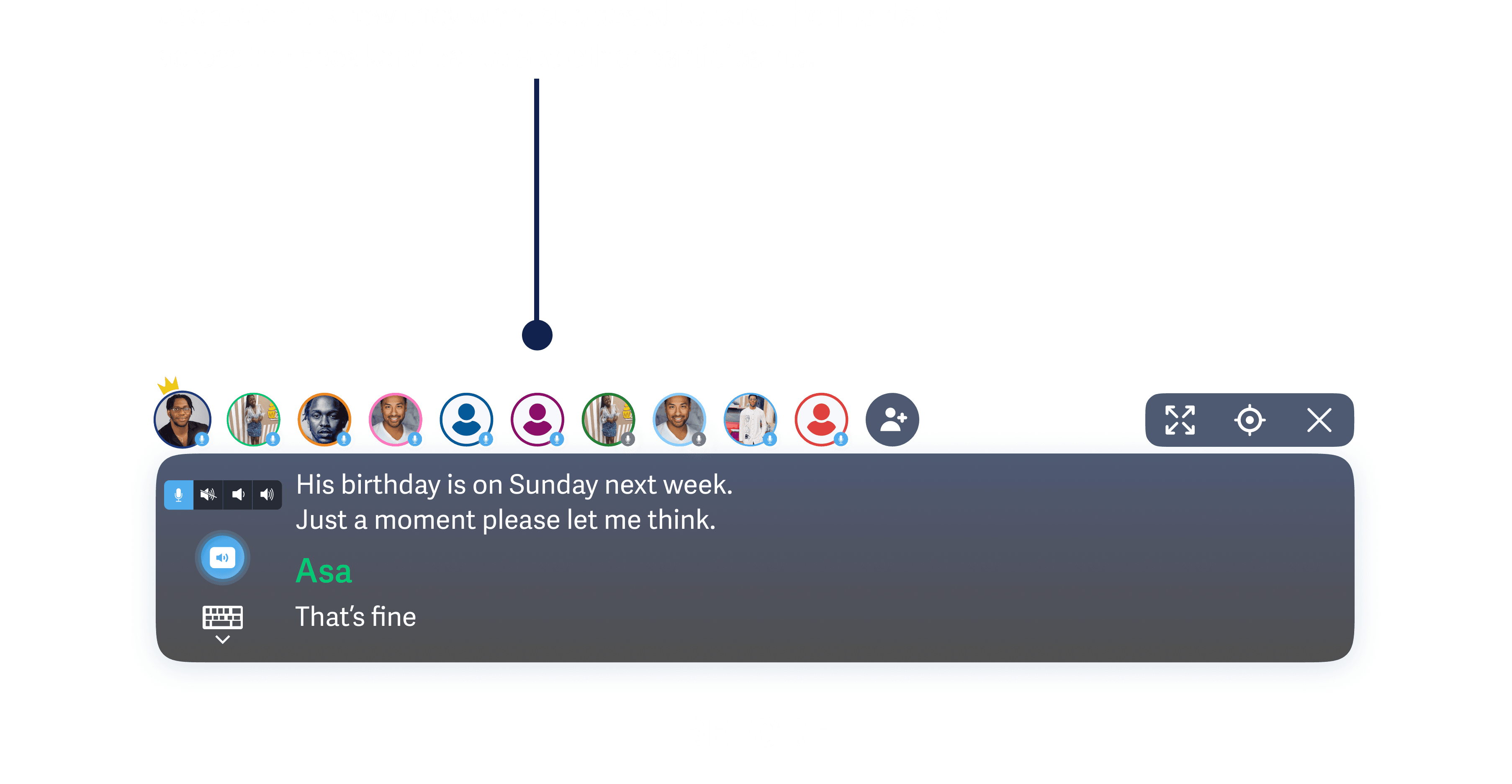
Issue 1 - Difficulty in accessing the different speakers when there are a lot of participants
2/3 of users had trouble distinguishing speakers in large conversations. One user said, 'Didn't realize I had to scroll on the speakers' bar; thought displayed speakers were all participants.
2/3 of users had trouble distinguishing speakers in large conversations. One user said, 'Didn't realize I had to scroll on the speakers' bar; thought displayed speakers were all participants.
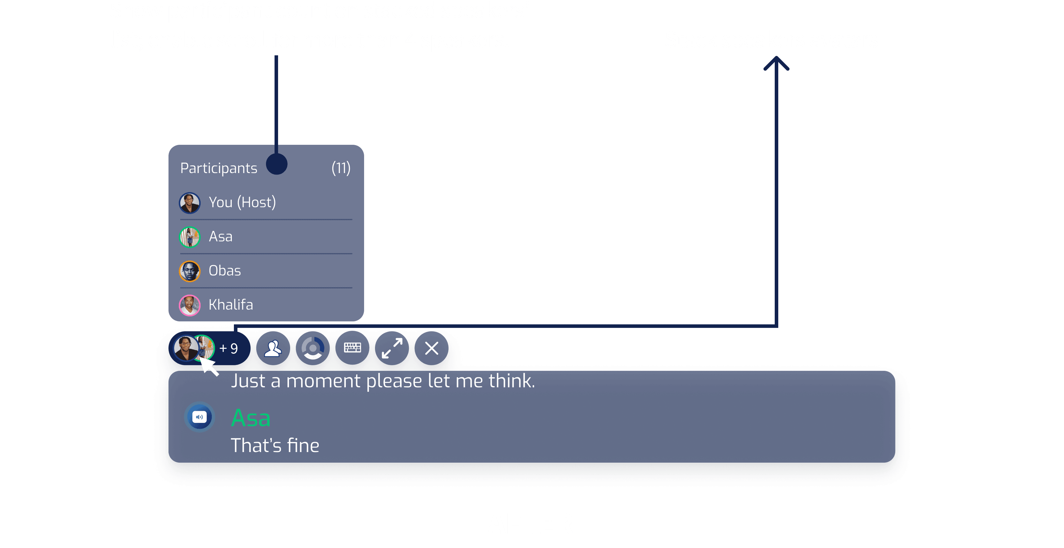
Solution 1: Stack avatars for more than 4 participants, and display the remaining count
After testing several apps, I chose to display speaker avatars individually in the bar. They stack only when participants exceed 2, and a clickable number allows viewing others in the conversation.
After testing several apps, I chose to display speaker avatars individually in the bar. They stack only when participants exceed 2, and a clickable number allows viewing others in the conversation.




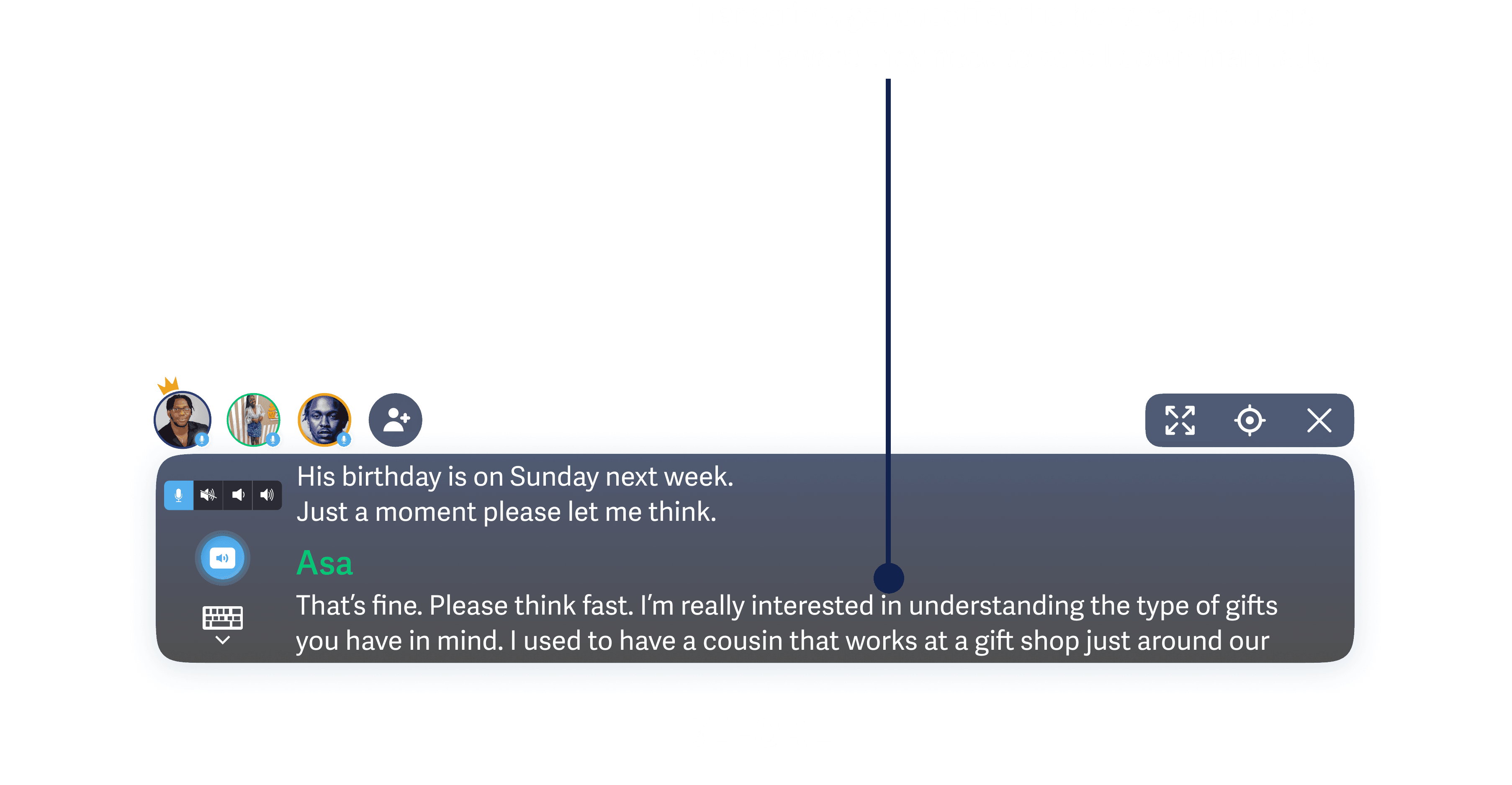
Issue 2 - Scroll experience for transcripts during captions wasn't clear in CC mode
1/3 of users were confused about scrolling for the last transcript. One user said, 'Transcripts cut off at the bottom; didn't realize I had to scroll down to see new entries during the conversation.
1/3 of users were confused about scrolling for the last transcript. One user said, 'Transcripts cut off at the bottom; didn't realize I had to scroll down to see new entries during the conversation.
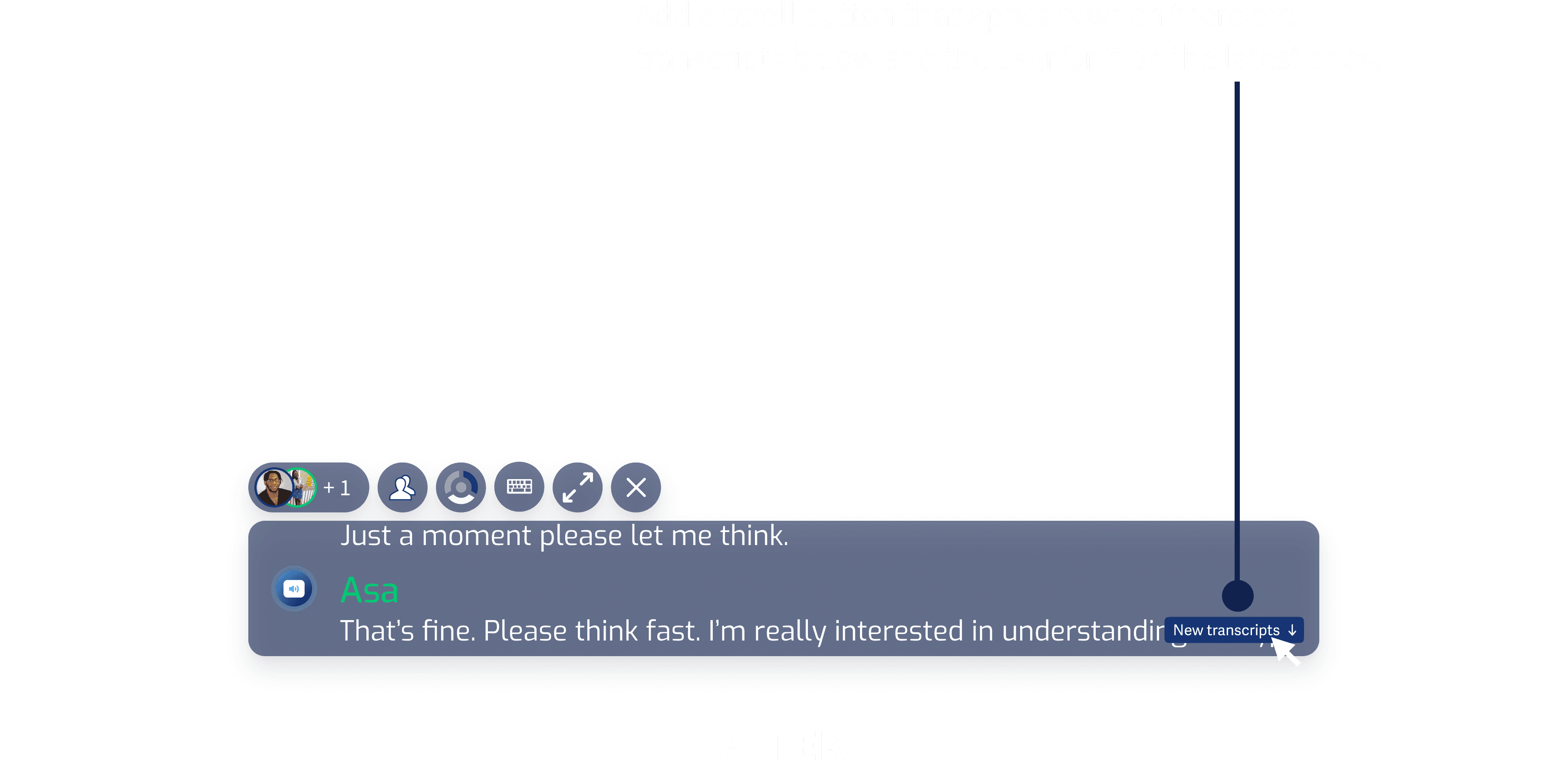
Solution 2: Add a button to access latest transcript and modify size of CC widget
Like the mobile version, I added a 'New transcripts' scroll button in CC mode for a quick review of recent, unseen transcripts. Also, reduced the size of the CC window for less obstruction.
Like the mobile version, I added a 'New transcripts' scroll button in CC mode for a quick review of recent, unseen transcripts. Also, reduced the size of the CC window for less obstruction.




Improvements + Hi-Fidelity Designs
Using feedback from test sessions, I iterated designs, made final improvements, and prepared design specifications, including the Notion document for developers' handoff.
Using feedback from test sessions, I iterated designs, made final improvements, and prepared design specifications, including the Notion document for developers' handoff.
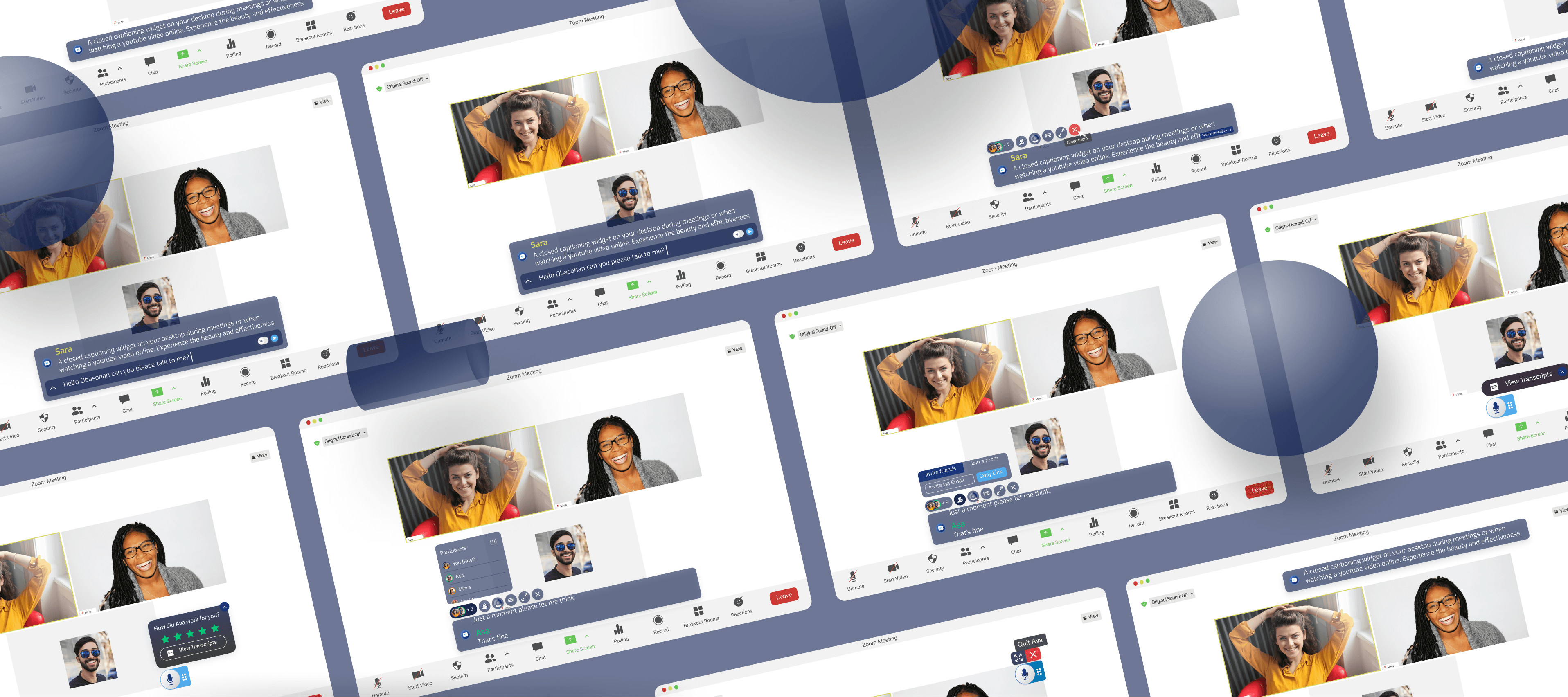


Product Showcase
I used Figma to create the prototype showcasing key screens of the final UX.
I used Figma to create the prototype showcasing key screens of the final UX.


The Process :